

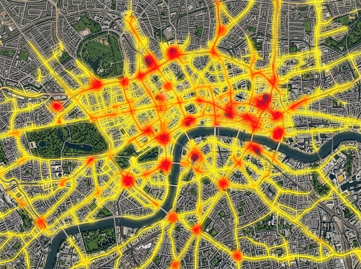
Heatmaps of activity
Turn thousands of pins into a single heat layer. See where your customers, calls, sales, or incidents cluster and where they fall off.
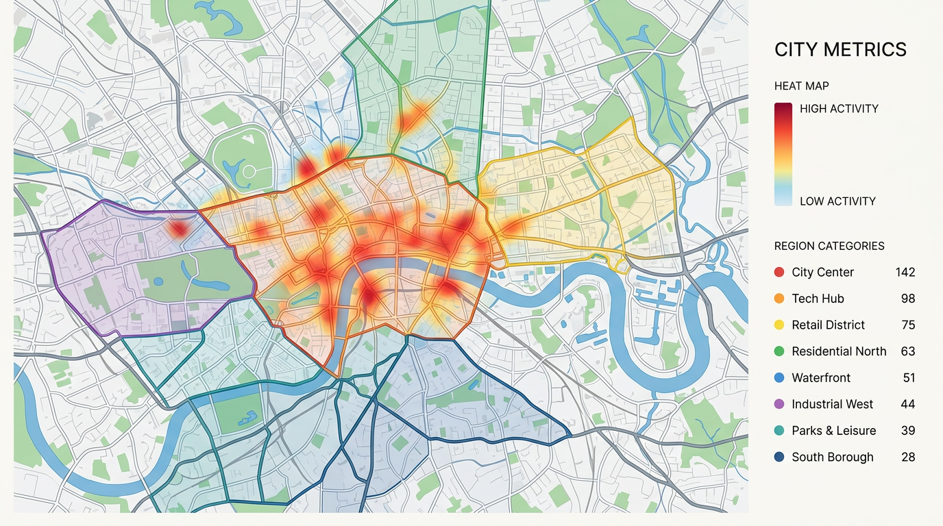
Plot your data on a map and read it like a chart. Build heatmaps, color regions by value, size pins by amount, and cluster busy areas. Find hot spots, gaps, and trends in seconds.
★ ★ ★ ★ ★“Data import and output and management tools, including polygons, heatmaps, unit data, geolocation, screening, and data import, are all easily accessible.”
Heatmaps for density. Color by category. Size by value. Region fills for counts by zip or county. Switch between views without re-importing your data.
Import a CSV, Excel, or GeoJSON file. We read your columns and build the visual. No SQL, no chart library, and no developer needed.
Send a link, embed the map in a report, or export a PDF for a deck. Every viewer reads the same map and can pan, zoom, and click to dig in.
Turn thousands of pins into a single heat layer. See where your customers, calls, sales, or incidents cluster and where they fall off.
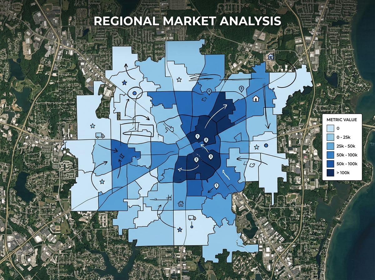
Fill zip codes or counties by sales, population, or any number from your file. Read the map like a chart and spot leaders and laggards in seconds.
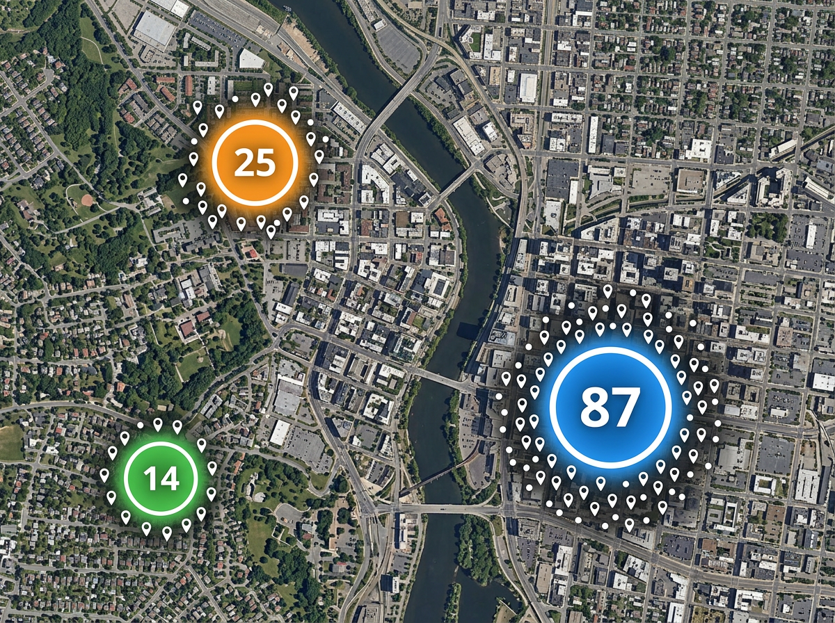
When a map has too many pins, cluster them into counts. Zoom in to break clusters apart and zoom out to see the big picture.
Scribble AI
Tell Scribble AI what you need. Try “draw a 500m buffer around every site,” “import this CSV and color by status,” or “measure the route from the depot to each stop.” It does it in seconds. No GIS training needed, and your team gets the same map, ready to share.
Try Scribble AI →Map data visualization means showing your data on a map so patterns become easy to read. You can use heatmaps, colored regions, sized pins, and more to find trends a spreadsheet would hide.
Any data with a location. That can be addresses, latitude and longitude, zip codes, counties, or shapes. Bring it in as CSV, Excel, KML, or GeoJSON.
Yes. Stack a heatmap, region fills, and pins on the same map. Viewers can toggle layers to focus on what matters to them.
Yes. Copy the embed snippet and paste it into a dashboard, report, or website. The map stays live, so updates show up the next time someone opens the page.